How do YOU respond to your photography client inquiries? Do you reply with your session prices? An e-mail back? Maybe even a phone call?
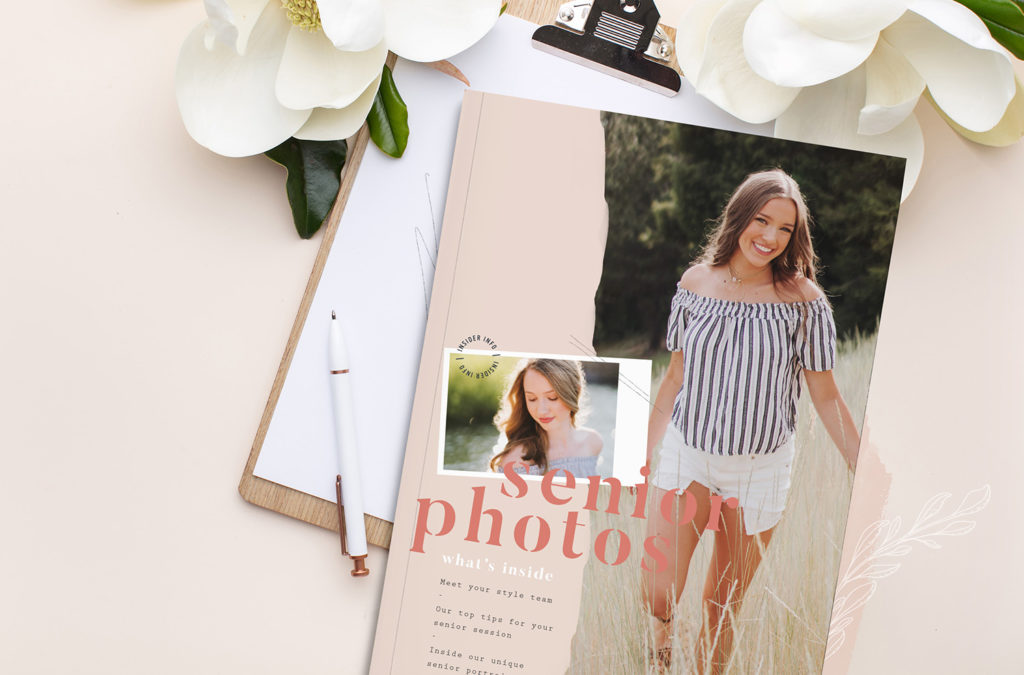
Imagine responding to your potential clients with a beautifully designed and customized client magazine that educates them on the incredible experience that you have to offer while showcasing your portfolio all at the same time. That is what the client inquiry magazine is all about… the hook. This is your one shot to wow them before they finally commit to hiring you.
The thing to remember when creating your inquiry magazine is that it’s your chance to educate your potential client on the experience they could have, if they choose to hire you. It’s like a blind date and you have to woo them with your stunning portfolio, witty personality, and show them how amazing your brand experience is. The client magazine is the visual presentation of what you have to offer.
Some of the most asked questions I receive when teaching about client magazines is, “What should a photographer include in the magazine?” “Does it go in a certain order?” “Is there anything we shouldn’t put in it?”
Let’s start with 10 things to include in your inquiry response magazine:
01. Personal Intro with Brand Images: this is like your digital hand shake followed by a winning smile and witty introduction. An intro filled with personality and branded images of yourself sets the course for building a connection with that potential client whom you haven’t even met yet.
02. 3-5 Things that Make you Different: your reader is already wondering why they should hire you so why not do the leg work for them? Research your competitors (without any emotional baggage) and find out how your client experience differs from theirs. Then simply highlight the wonderful things you offer that others don’t. This will help your potential client know the unique value that you can provide for their session and images.
03.Pain Point Messaging Throughout: this is a bit more advanced than what most photographers do, but it will set you far above the rest. Find out your target market pain points and then find ways to showcase the solutions your brand can give them. For a senior photographer, they may be scared they won’t know what to wear for their session. If you offer a fashion consult and a what to wear guide, then BOOM – explain those factors to show that you can help them.
04. Studio Showcase (if you have one): clients like to see where you work and your studio should be no different. This is where the magic happens, after all, and seeing their studio in your client magazine helps them envision themselves taking part in your client experience.
05. Visuals of your Client Experience: remember where I told you to find 3-5 things that make you different from your competitors? Include images all throughout your magazine that showcase those differences. DO NOT, I repeat, DO NOT just throw a bunch of portfolio images in your magazine and be done. That’s what most other photographers do… you want to be memorable; set apart from the rest. Trust me on this one. Have a fashion closet? Show pics of your clients going through the beautiful clothes or trying on accessories. Offer makeup and hair services? Capture the process and feature it in the magazine.
06. Client Timeline: potential clients want to know how long the process is going to take from beginning to end, so include it in your inquiry response magazine. Showcase a timeline that involves your session day and the events leading up to and after it and how long they take.
07. FAQs: if you want to field questions via email all day, then keep these out of the magazine. But if you want a streamlined process that fully educates your target market without spending the unpaid time doing so, then list out and answer any frequently asked questions you get from your inquiries. Answer questions like, “How far in advance should I book my session with you?” and “Do you accept payment plans?” so that your potential client can feel fully educated.
08. Testimonials: your client magazine should be riddled with at least 10-15 testimonials from your past clients. To really make an impact, include the pictures of the client leaving the testimonials so that your reader can put a face to a name.
09. Full Price List: you want to share your full price list after providing a visual showcase of the experience your brand provides. Your audience will get to see the VALUE you provide before they see your full price list, which will help them understand why you are priced the way you are.
10. Product Display: if you offer products, remember that you want to highlight that fact just as much as the session, itself. Show your reader your stunning products full of gorgeous images. Doing so adds value to your brand and reminds your potential client that you have an array of products to memorialize their favorite session images.
BONUS: How to Book with You: after your reader has browsed the magazine, they’ll likely be a tad overwhelmed with all the info, but ready to book with you. To help them move forward to the next steps, include a 3 point checklist to how they can book their session with you. Include things like how they can secure their date with a session retainer, when they’ll sign the contract, and when they’ll get to pick their session date.
Now that I’ve told you everything to include, let’s talk about what NOT to include in your inquiry response magazine:
01. Table of Contents: including a ToC is a sure way for your reader to skip all the details showcasing your client experience and head straight to your pricing section instead. YIKES. You want them to see all the incredible value you have to offer BEFORE they see how much it’s going to cost them. This way, they understand the WHY behind the how much.
02. Blank Pages: people’s attention spans are short and if they’re taking the time out of their busy day to browse your client magazine, then you better make sure you’re filling that time with valuable content. If your layout includes a blank page (usually before your intro, or on the back of the cover), that’s not very interesting or attention getting and your reader could decide that it’s not worth their time. Make sure every page at the very least has a beautiful image on it.
03. Sale / Mini Session Info: do not include any kind of session or sale offer that is less than the prices you show in your client magazine. Even if it’s a Black Friday or Cyber Monday sale. Your client magazine should be for your full session clients only. If you do offer mini-sessions, you need to have a separate mini-session inquiry guide for when you launch those sessions. If you offer a sale, you can still send the full client magazine to inquirers with the subject of a sale in your response email.
You don’t have to do it all alone.
If all of them seems incredibly overwhelming to you and you’re wondering how much time this is going to take for you to put together a complete client magazine, consider getting a client magazine template! They are the ultimate easy button for inquiry response magazines!
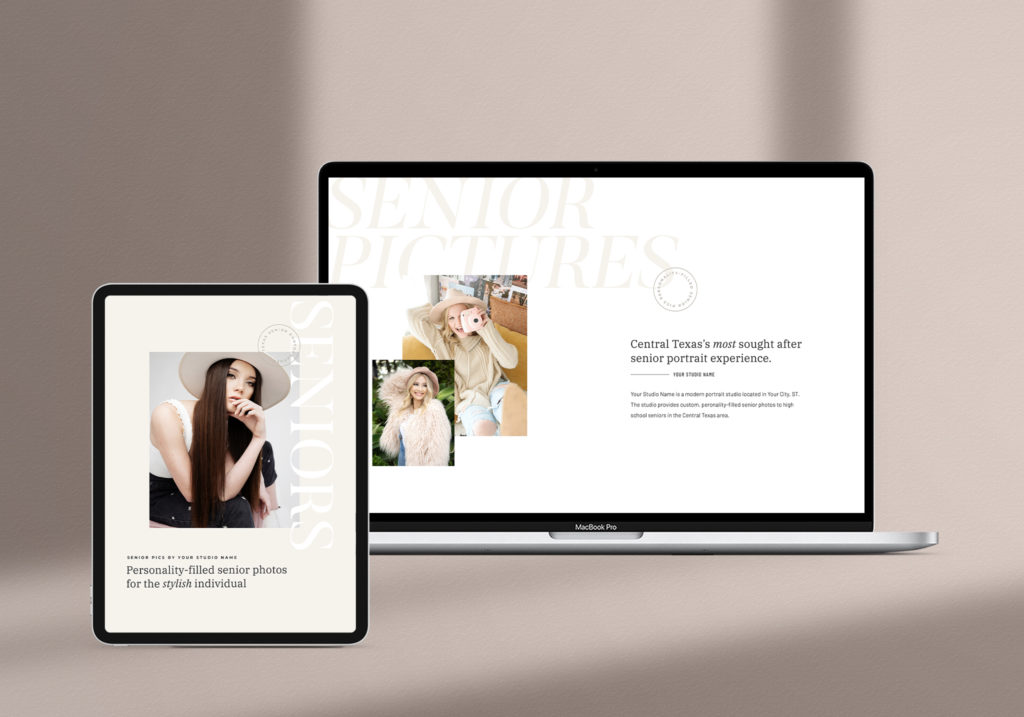
We have several different designs in the A-List Shop and our BRAND NEW DESIGN is coming NEXT WEEK! These all text included, done-for-you magazine template allow you to fill the pages with gorgeous images as well as details on why they should hire you. When potential clients are able to dive in to your brand with a memorable digital or printed magazine, they are more likely to hire you. It’s the ultimate resource for increased bookings.
Why we love our client magazine templates:
1. they’re easily customizable to your brand
2. they include pain point messaging throughout
3. they allow you to visually display your client experience
4. they include factors of the know, like & trust funnel
5. no guess work on what to include – we’ve done it for you
Want to see a sneak of our brand new client magazine template that just dropped in the A-List Shop?!?


+ show Comments
- Hide Comments
add a comment